Minimalist Branding Strategies
Why less wins: clarity, consistency, and unforgettable recognition.
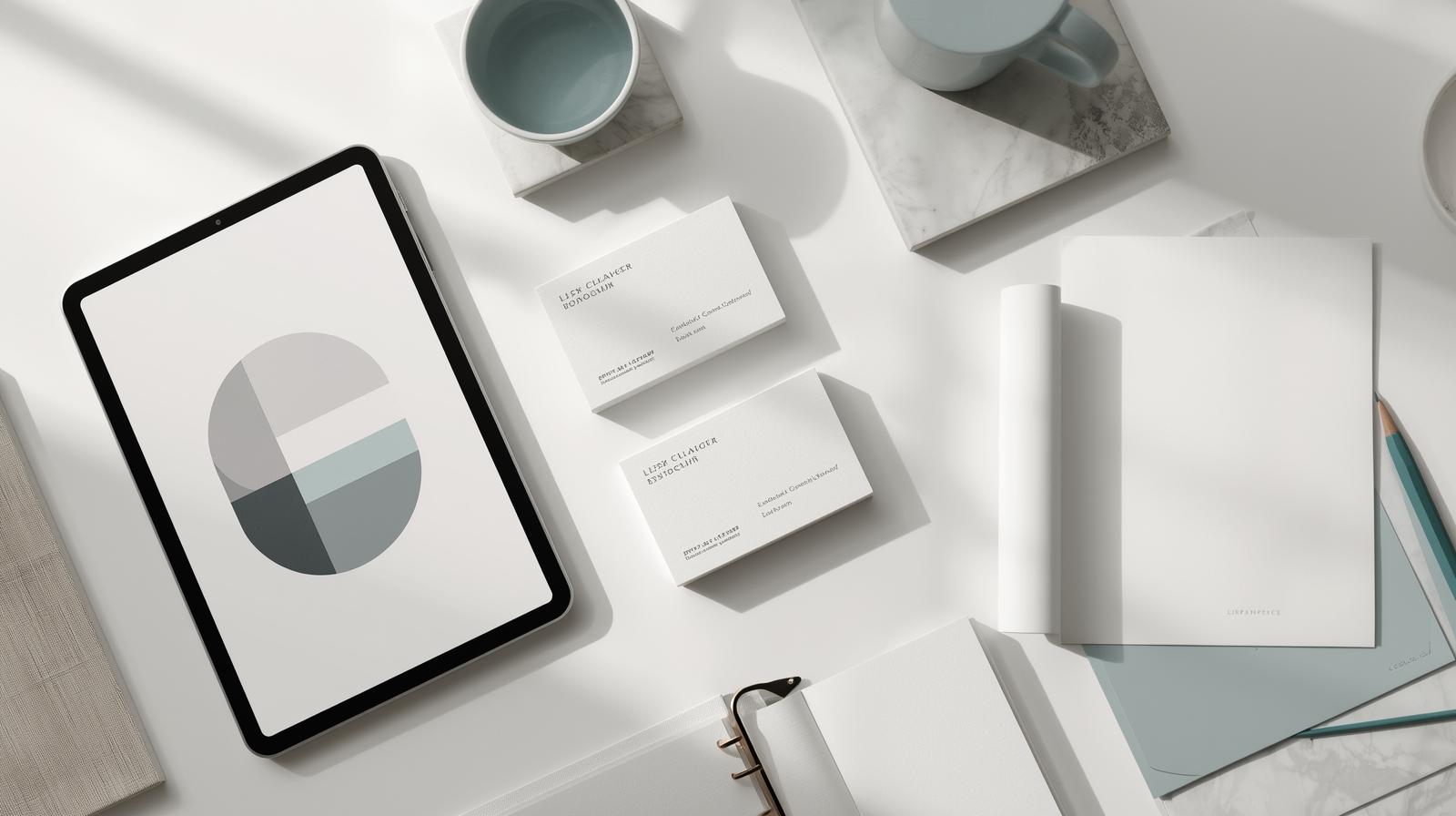
Minimalism in branding is more than a design trend — it’s a strategy rooted in clarity and focus. In a world overflowing with content, people are drawn to brands that communicate their value simply and memorably. Too many colors, fonts, or overly complex visuals can dilute your message and make your brand harder to recognize.
Minimalist branding isn’t about stripping your identity down to nothing; it’s about curating with intention. A strong brand identity is built on a few core colors, one or two fonts, and consistent application across every touchpoint. This ensures that your business feels polished, cohesive, and instantly recognizable. Think about brands like Apple or Nike — their simplicity is what makes them unforgettable.
Messaging is just as important as design. The best taglines and brand statements are short, powerful, and memorable. They cut through the noise and leave a lasting impression. Instead of trying to say everything at once, focus on the one message you want your audience to take away and reinforce it consistently.
Minimalism also improves user experience. Clean, spacious design allows your audience to focus on what really matters: your product or service. Whether it’s a website, a social media post, or a business card, your brand should communicate professionalism, confidence, and clarity.
In today’s crowded marketplace, less truly is more. Simplifying your branding helps you stand out, makes your message more impactful, and builds lasting recognition in your customer’s mind.
Ready to simplify and shine?
We’ll craft your palette, type stack, and mini brand system—then apply it cleanly across your key touchpoints.